If you are responsible for helping business decision makers analyze data, you are probably familiar with questions like:
- Are we on track to meet or exceed last year’s sales totals?
- How is our sales team doing now, compared to this time a year or two ago?
Today’s demo file, weekly sales comparison charts, v3, can help answer these questions. It consists of an Employee table with 20 records, a Sales table with approximately 40,000 records, seven chart types, and an option to chart weekly amounts either individually or cumulatively.
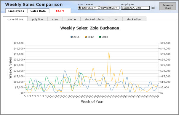
When we look at the weeks individually, it’s clear that Zola Buchanan’s sales figures are mixed so far this year, compared to 2011 and 2012. But what may not be immediately apparent is whether overall she’s doing better, the same, or worse.
However, if we generate the chart again, this time with the cumulative option set, we can see that she’s doing slightly better this year.
(Thank you Stacy Sandler of L’eft Bank Wine Company for convincing me that a line chart would be a great way to display this — I was more than a little skeptical.) Of course not all chart types are equally suited for conveying this information… area charts work well, with semi-transparency enabled…
…and some, like stacked columns, are particularly ill-suited for this purpose (or, in my opinion, most other purposes), but are included for the sake of completeness.
Under the hood, all charts are based on variable array data, generated via methods similar to those explored a couple years ago in Array Charting part 1, part 2 and part 3, so I won’t rehash any of that here, but there are a few things about this demo that I think are worth mentioning.
• You can chart company-wide sales by clearing the employee pop-up.
• The “all employees” in the pop-up is accomplished via the 500-point invisibility trick.
• Poly-line charts reveal gaps, whereas curve-fit line charts fill them in.
• Weekly sales are parsed using GetSummary on a standard summary field like so…
• For cumulative charting, my original plan was to define a running total summary field…
…and then use GetSummary to slurp up that value, but it seemed a bit slow, so I ended up not using that field at all, but instead accumulating the running balance in memory, which turns out to be considerably faster:
• You can test the old method by running this script manually if you wish.
• The demo actually contains sales data through the end of the year 2015, but to simulate “where are we now?” it cuts off at the current day (and then rolls back to the last complete week). If you are reading this after the year 2015, you can run the “create sales entries” script to generate some more data.


Hi Kevin, I listened to you on the FileMakerTalk Podcast and could not resist to come to see your blog. You have a lot of useful information here and examples! Great work, thank you very much.
Thanks. I appreciate you taking the time to comment.
Thank you Bruce Robertson for identifying the problem with the chart title and legend in v1.
The demo has been updated to v3 to fix a bug in the “create sales entries” script.